Rose Uniacke
I have been enamored by Rose Uniake's home. Every inch has been thought through, every mundane cord hidden. Every detail is handled, and handled in a beautiful way. It's a marvelous inspiration for how your home can serve your life.
Her home was built in 1861 for James Rannie Swinton, a society portraitist. Rose herself got into the industry by restoring antiques. Her mother is also an antiques dealer with a shop not far from Roses. Upon opening her own showroom, of antiques and custom designed furnishings and accessories, she quickly became the go to designer in London for classic restrained interiors.
“Rose is a remarkable talent, charting a route utterly distinct to her. Her austere interiors hum with atmosphere; every corner is an essay in balance, restraint and exquisite quality.”
Her own is the epitome of restrained elegance. Of course the backdrop of amazing architecture, of which she had a hand in restoring, certainly makes that easier. In my experience having minimal restrained interiors requires first fixing the architecture of the home, whether traditional or modern. No surprise that's my favorite part of working on client's homes.
Often when discussing interiors with clients we start talking about whether something matches or if it goes. The idea of any interior is to look collected and thoughtful. But a client, or someone working on their own home, can get scared and default back to matching. Like say the fashion "rule" of not wearing brown with black. Well that's an absurd rule. Just as is making sure everything in a room matches.
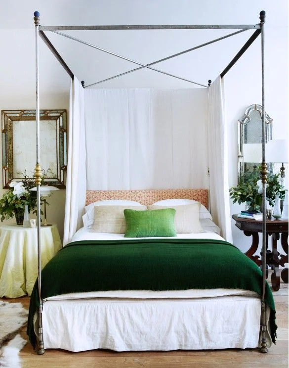
That said I want to discuss Rose's bedroom and why it works while seemingly nothing matches. The first most important, to me, element in a room is texture. It's what adds a rooms patina. In this space she combines the warm natural wood floors with an animal hide rug, a natural (as in not starched within an inch of its life) linen dustskirt and the metal of the bed all keep the space interesting even if one was only looking down. But to pull your eye up she has incorporated the same linen from the bedskirt to the panels on the bed. In a room with such grand proportions any bed besides a canopy bed would be insignificant. Without the linen panels on the canopy bed the feeling would be too harsh. With every hard surface there's a counter soft surface. This balance keeps the room livable. In terms of bedside tables and lamps they're both completely different. Admittedly the nightstands being different heights drives me batty. However having different nightstand styles and lamp styles is a chic way of infusing the owners style into the space. Say the woman is more modern while the husband is traditional, they each have their style in their space. While still being a complement to each other.
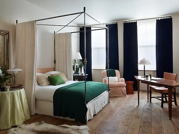
In this pulled back image you can see how the room flows. The headboard is upholstered in the same fabric as the chair. The bedding accents and table skirts are various shades of green. The green is pulled across the room to the chair by using a green throw. The dark drapery panels serve to draw your eye up visually expanding the size of the room while countering the weight of the bed. Again adding balance. The wabi sabi nature of this space makes it feel thoughtful and comfortable without being precious. When a room appears too planned it can feel uncomfortable. A space can be like a painting. It's pretty to look at but certainly that's all one would want to do with it.
Rose has so many gorgeous spaces to review and I didn't even get to discussing the video. I do hope you watch it. Even the video production is done with a thoughtful restraint. It's gorgeous.
The more I dig into Rose's interiors the more I want to discuss restraint and the beautiful importance of it. So I'll do that in the next post. Well actually I'll continue with Rose this week. I love to really dig into a designer's work and the art of design.
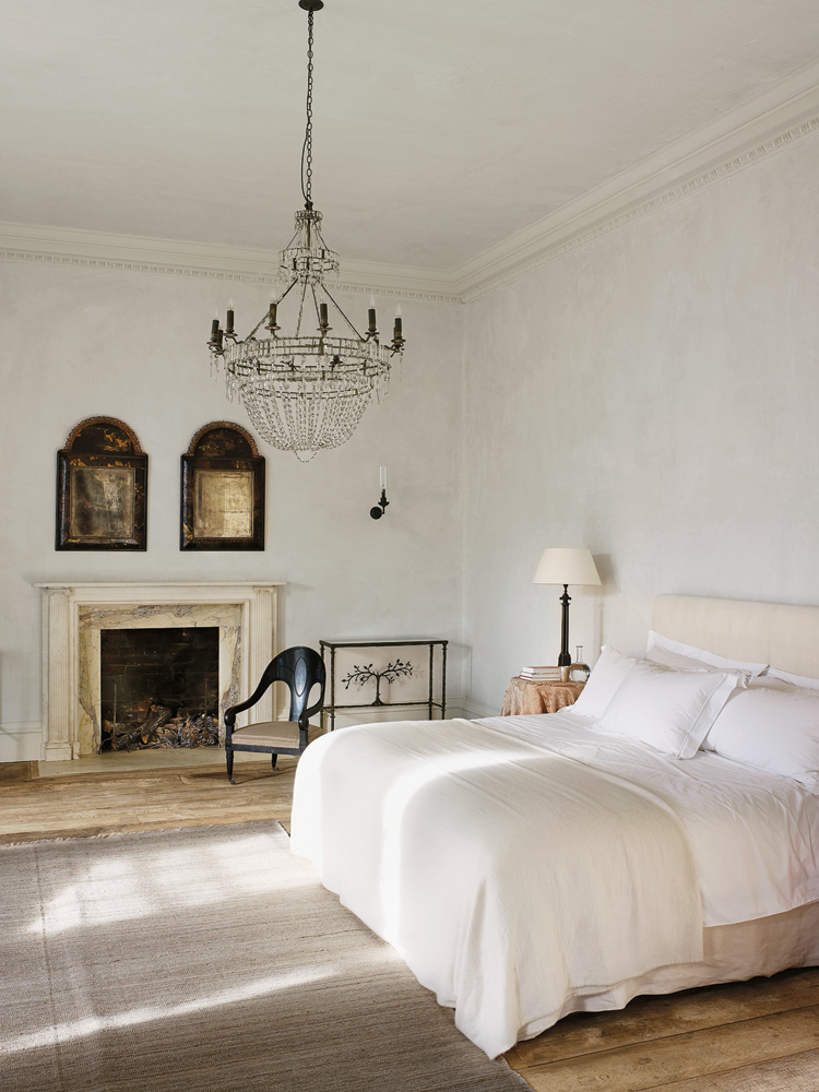
Here are a few more gorgeous images of her home...
“I like playing with space. I don’t like furnishing just for the sake of it. I like referencing the context of a building.”
The New York Times wrote a beautiful piece on Rose and her home in 2013 that you should check out here.
The purpose of this blog is to study the art of interior design and how it relates to all facets of life. I love to take a design subject and dig deep into it learning what one can from the process. Please contact me using the contact page for design inquiries. Thank you!


